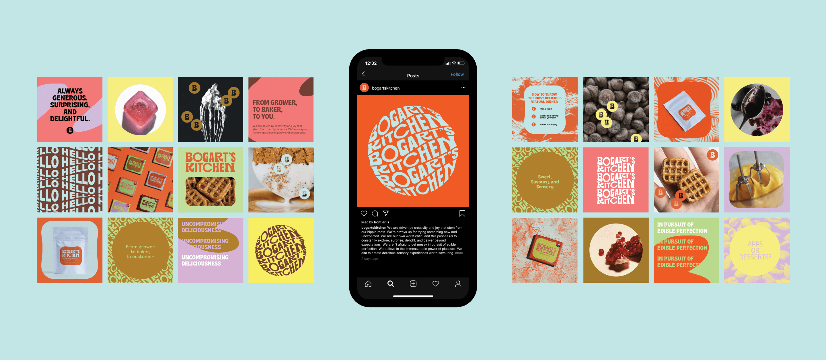
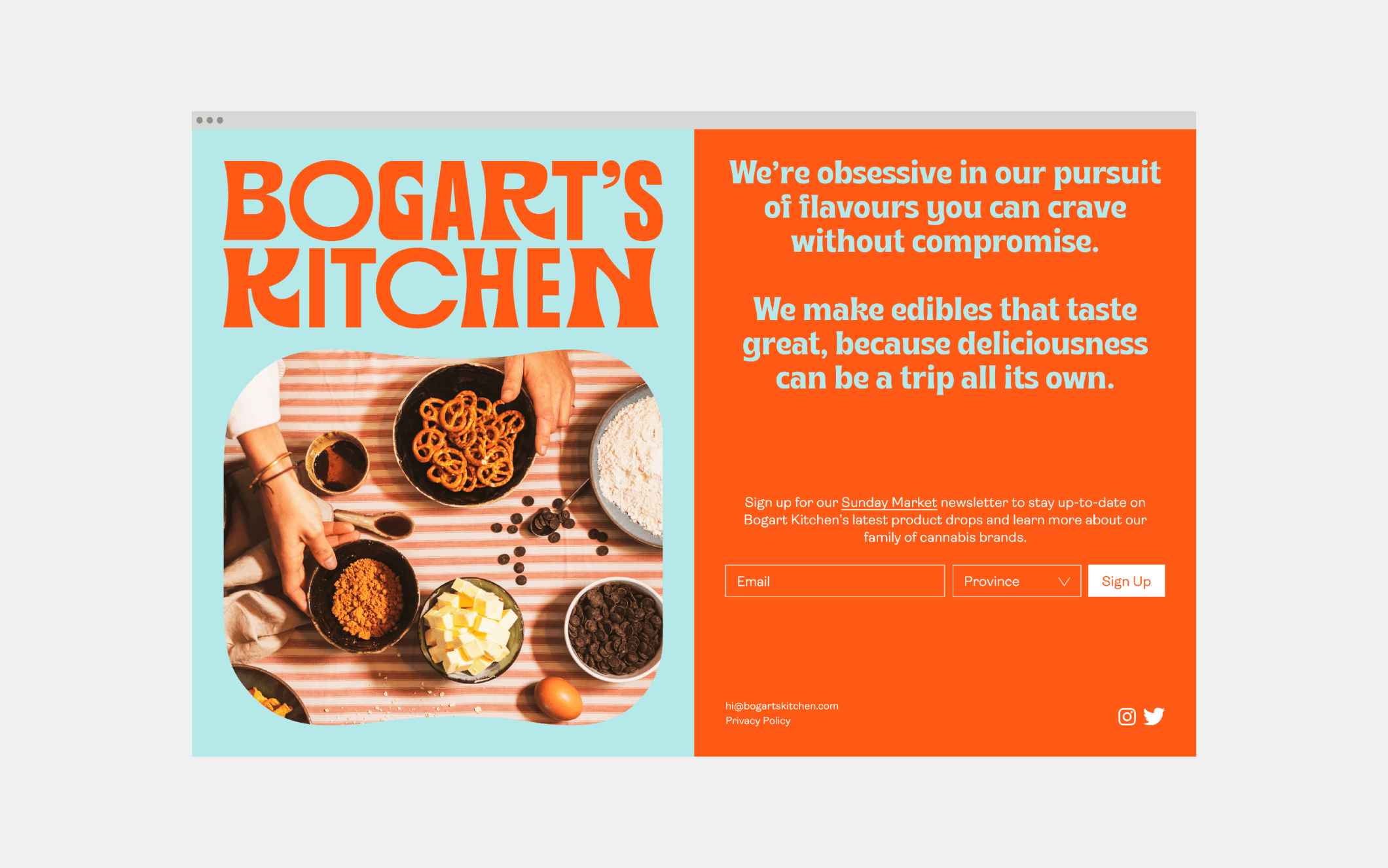
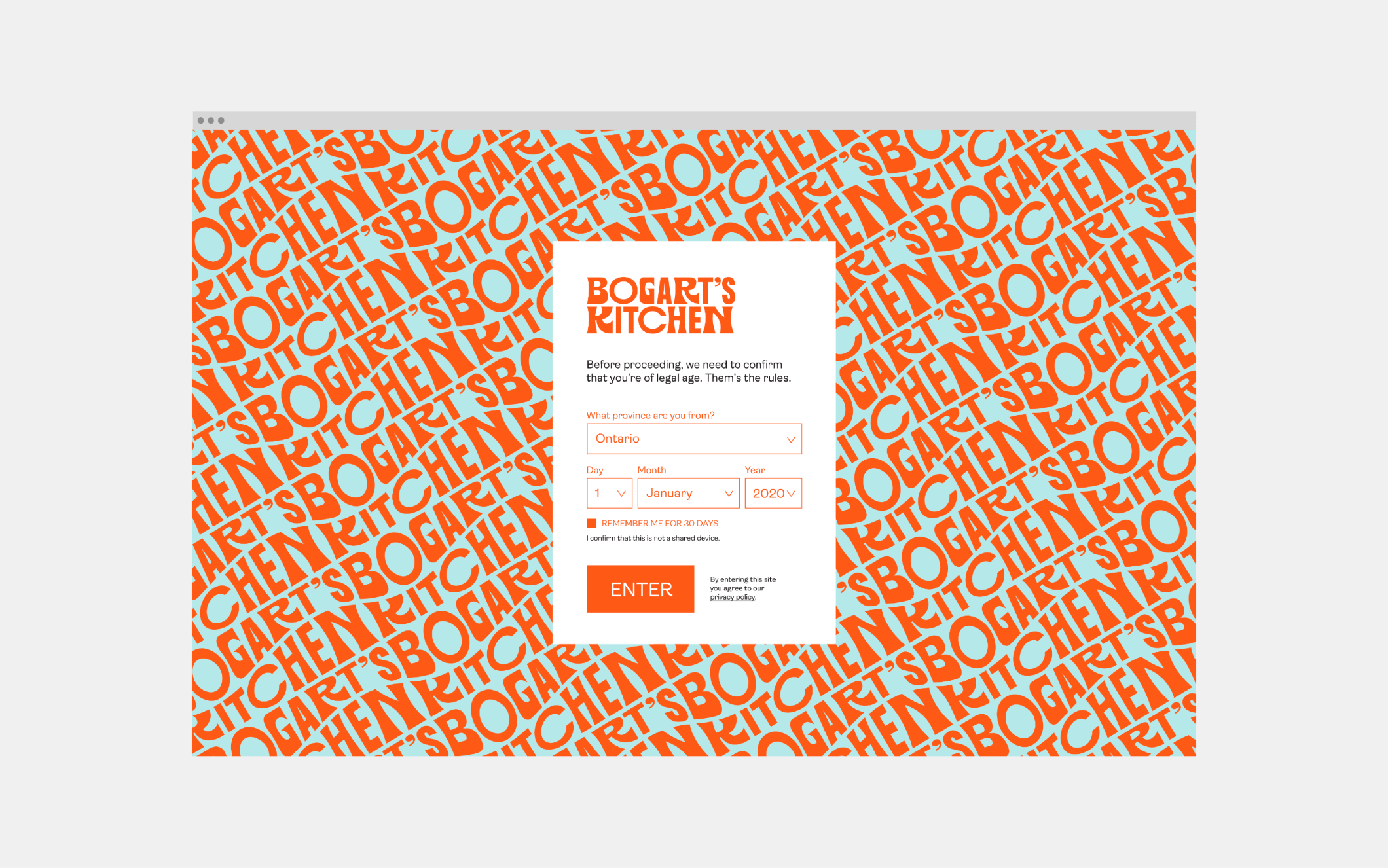
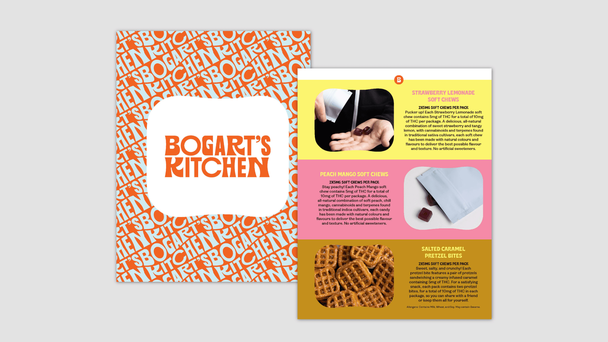
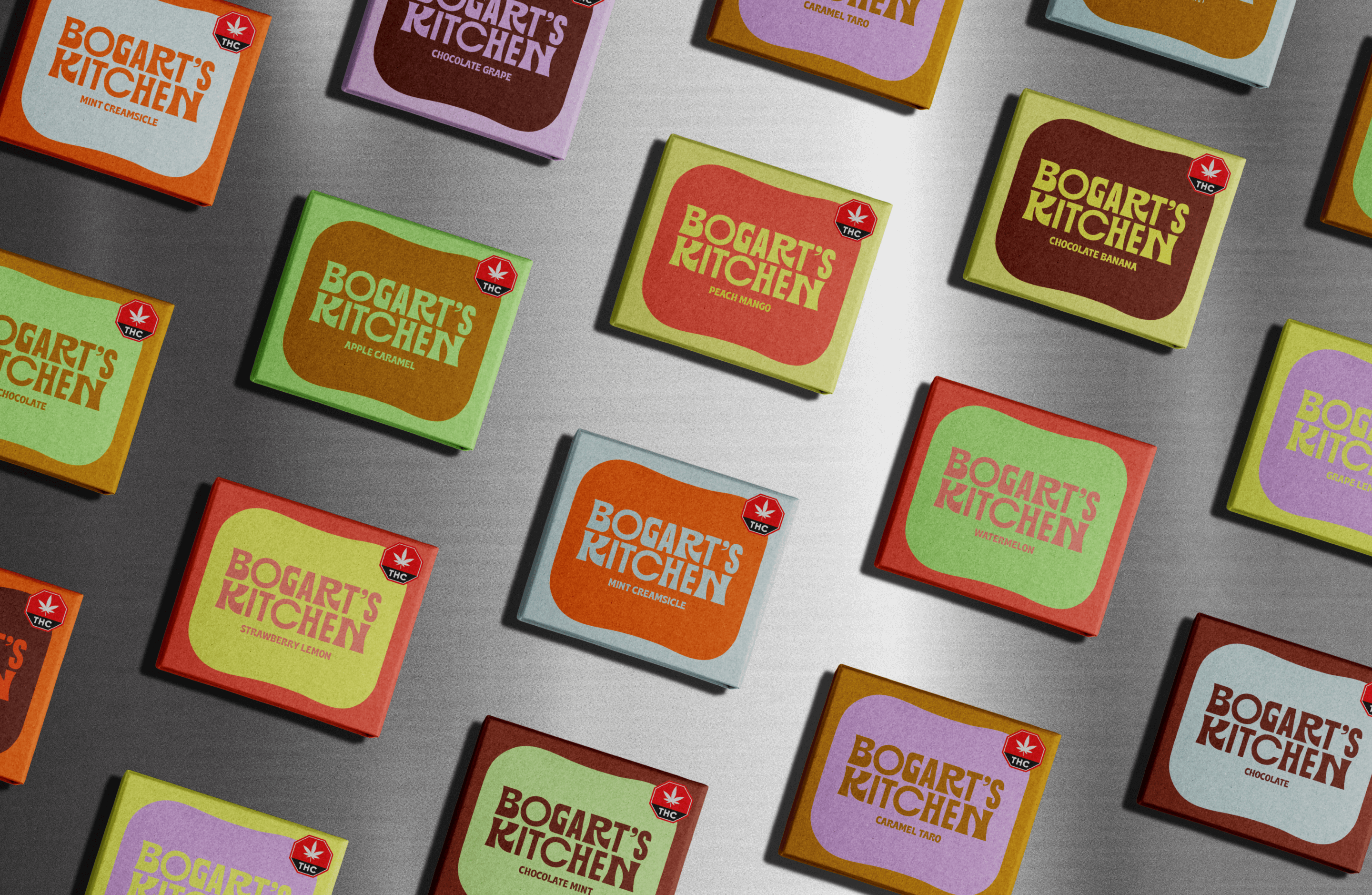
Bogart’s Kitchen is all about edible cannabis experiences. The company approached Frontier in search of brand positioning and a visual identity. After developing a framework that outlines the brand’s purpose and ambition, Frontier created an identity that is as deeply inspired by food as it is by the company’s values. All the brand elements, from the logo and typefaces to the use of duotones and the messaging copy, combine two complementary
sides—one motivated by pleasure and experience, another that suggests an obsessive devotion to craft.
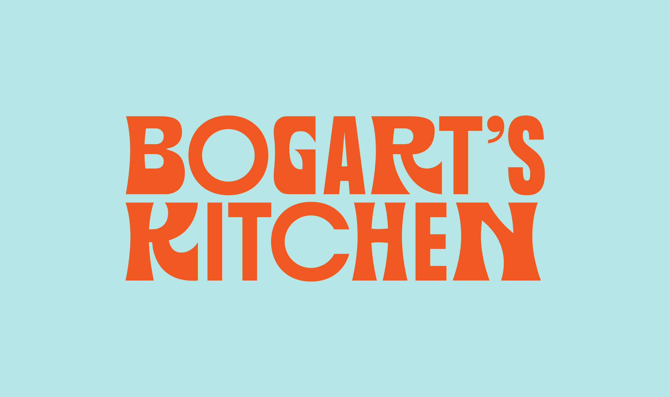
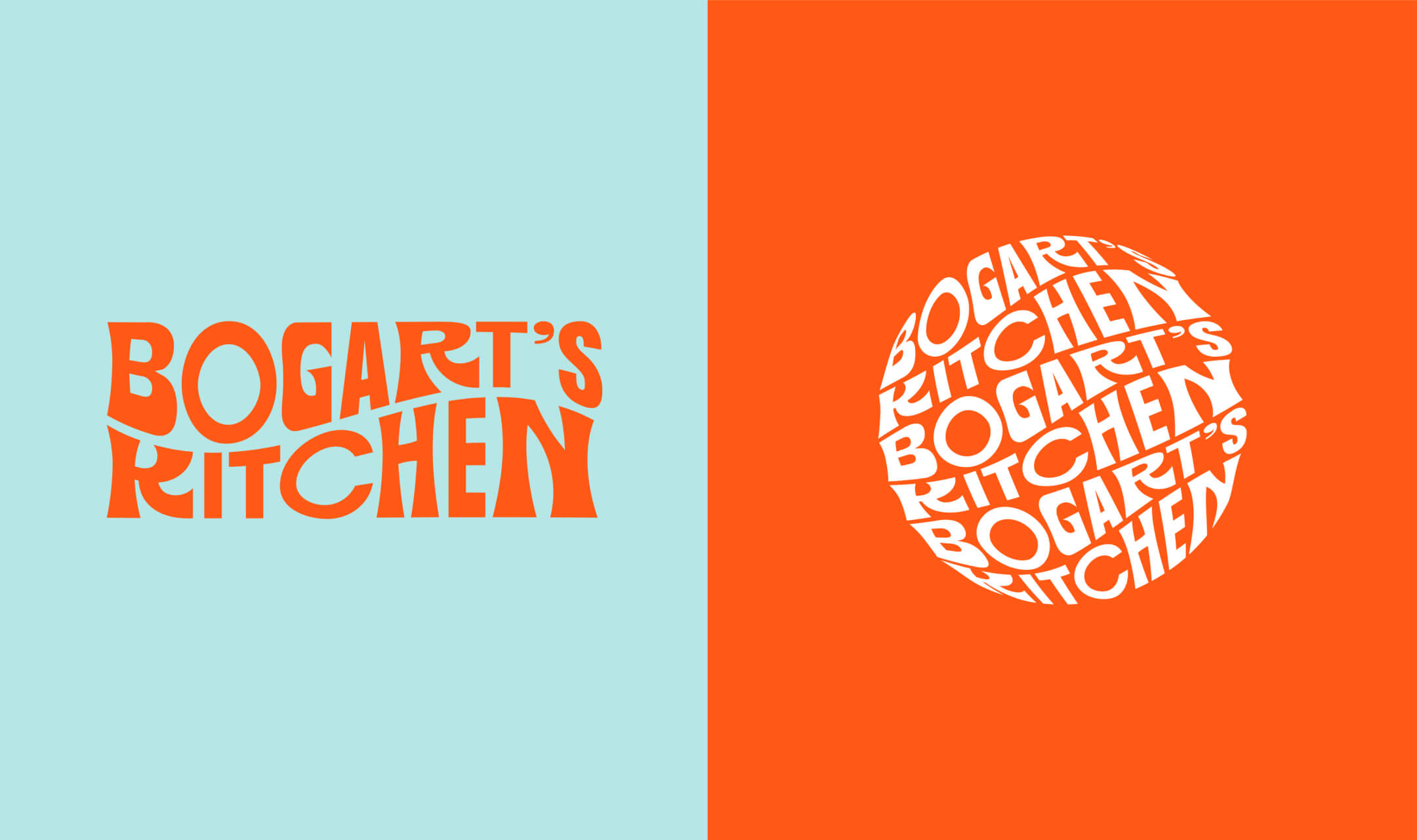
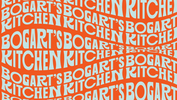
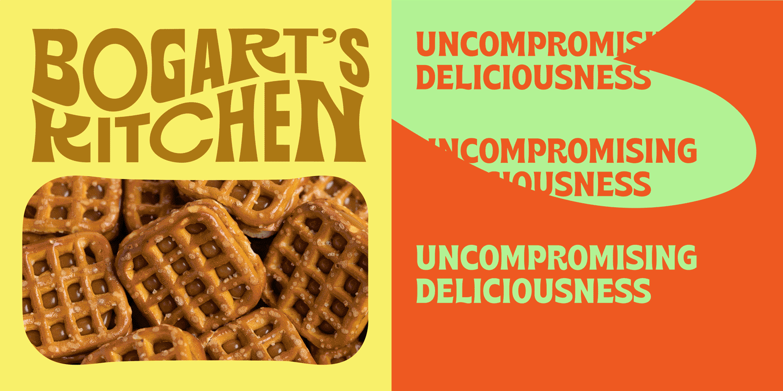
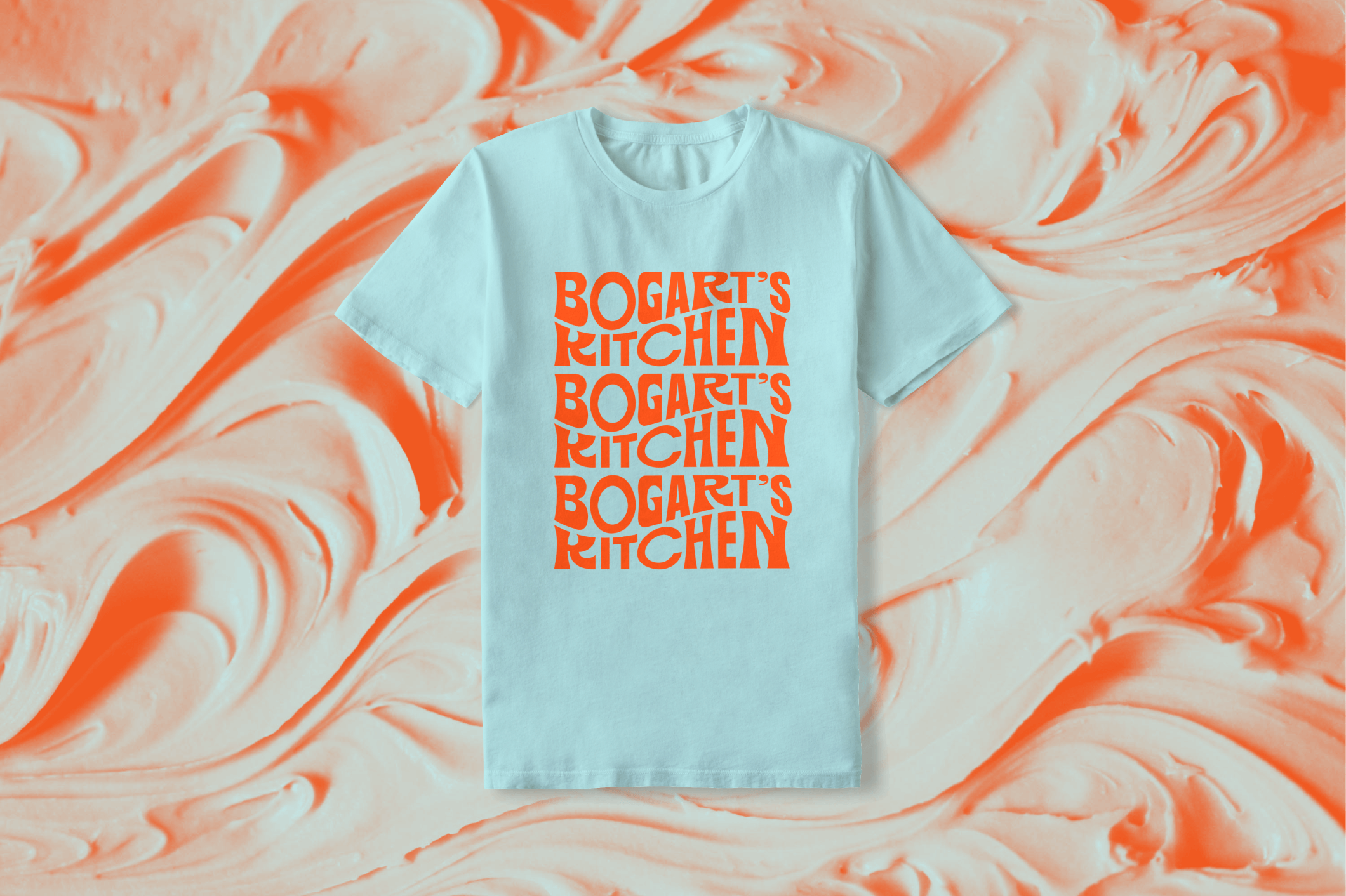
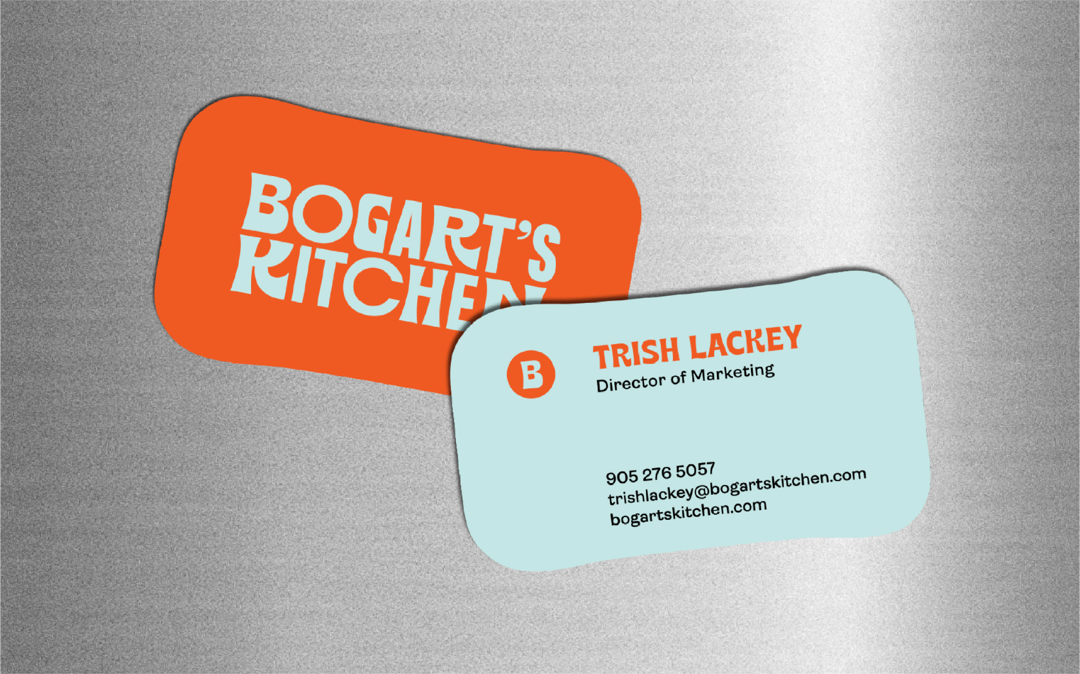
Building on the idea of complementary pairs, the design approach embraced industry regulations and guidelines while using visual elements to entice and intrigue. The logo combines Chronic Sans, which represents experimentation and the company’s hippie roots, with Formula Condensed, which implies precision and expertise. More broadly, the visual identity employs two typefaces, Brice and Ambit. These choices, combined with bold colors, curvaceous forms, and bright, close-cropped photographs, accompany the Bogart’s Kitchen story.
Designed by Eric Francisco and team at Frontier Design Inc.